
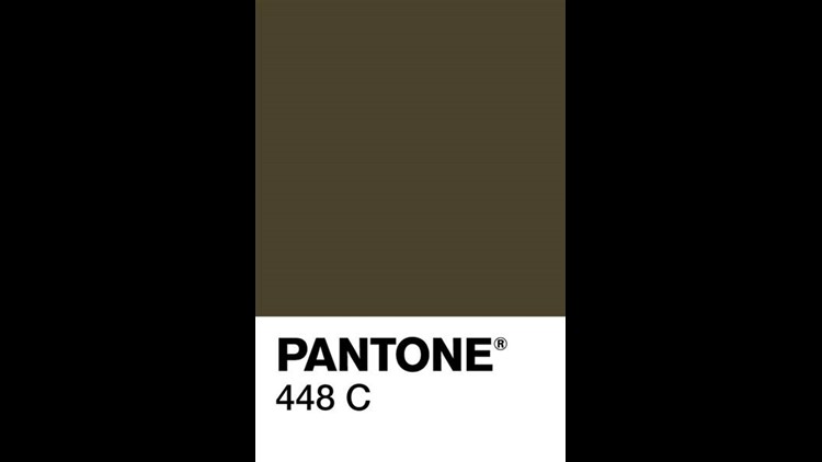
If you're looking for a new shade for your house interior, you can't go more wrong than Pantone 448 C.
It's recently been declared the world's ugliest color, the result of an Australian research and marketing project designed to discourage people from smoking.

Australian agency GfK asked 1,000 smokers what color they thought was the worst to look at, with the idea that the color would then cover cigarette packages.
The shade 'opaque couché,' which respondents said they associated with concepts like "death," "dirty" and "tar," won (or lost) the race.
Since the color was added to cigarette packaging in Australia, sales are down. In May, the color was added to packages in the U.K. as well.
But Pantone reps are like parents who love all of its children, no matter what anyone else says.
"At the Pantone Color Institute, we consider all colors equally," executive director Leatrice Eiseman told The Guardian. For her, there was "no such thing" as the world's ugliest color.
Instead, she associated 448 C with "deep, rich earth tones" and said it was popular on sofas and shoes.
Meanwhile, Cosmopolitan found 18 examples of times when the color was more exquisite than excretory, like on moth wings, abandoned factory shutters and multiple fashion collections.
Which just goes to show you that color, like beauty, is in the eye of the beholder.